You have not yet responded to the forum.

Here you will find the last 3 forum topics
you have posted a comment on.
0 | 0 | 0 | 0 | 0
0%
+ add shout
cookielovescookies
Thanks to everyone whos supported me! More fun events coming soon!
To join the forums you need to be logged in.

Click here to register your own account for free and I will personally explain to you how you can start getting your own fans and, making popdollars.
> Close
Helper
15 of the 24 stars earned

Forum

Game < Virtual Popstar Page: | Next | Last
Poll: Did you find this useful?
Designer Colour Guide.
Private
World Famous


I have seen too many people (mostly beginner designers) have their base as PURE colours.
This is a no-no.

Therefore I have put together a small chart of colours to show people what base colour they could use when doing a certain colour.

On the chart with have:
White
Black
Cyan/aqua
Bright Pink/Hot pink/ Pink
Pea Green
Silver 
Gold.

If you have any request of what you would like me to add to the chart, just leave a message and I'll add this. I'm putting this together to help people out with their shades too instead of them doing a pure pink base and a really dark shade so it sticks out like a sore thumb.

Sorry if the chart is lop-sided...me no do straight lines.


Some colours were taken off this:


To show that the pink is pink and not purple: (It was meant to be like a 'hot pink'. The original colour was taken from PURE PINK FF00FF)

Private
World Famous


I'm gonna be rude here for a tiny bit, I feel like your colours are often still far too bright with little contrast. Like I suppose it's what you like but your reds or purples just really don't do the thing for me. 

Most of the colours from here I took off my designs.

This was more of less meant to be like a help-guide to stop people using pure colours of their bases as it's extremely annoying to highlight.


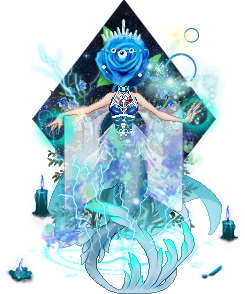
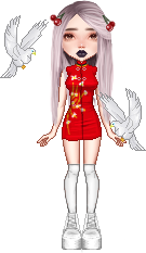
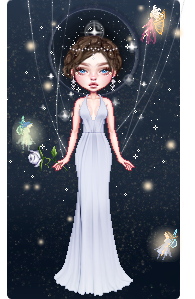
The colours I picked from these dresses:


For the reds and purples:
It depends on the shades. I like bright shades of purple and red.
Criminal
Bathroom Singer


I'm gonna be rude here for a tiny bit, I feel like your colours are often still far too bright with little contrast. Like I suppose it's what you like but your reds or purples just really don't do the thing for me. 

I think its only a basic tutorial for beginner designers - after a while of designing most people would experiment and work out other ways of colour and things.

Besides they arent that bad xD
Draizor007
Streetmusician


<3 i think this is exstramly helpfull and im glad you made it. 
Private
World Famous


<3 i think this is exstramly helpfull and im glad you made it. 

Not at all <3
Thanks for suggesting gold and silver.
Ronella
World Famous


Thanks a lot ♥♥♥ I always had problems with finding the right coulour ;D
Private
World Famous


Thanks a lot ♥♥♥ I always had problems with finding the right coulour ;D

Haha glad I could help.
If there is any other colour you want me to add, then please do <3
Ronella
World Famous


yeah, it'd be great if you could add some blue colours bcs I love blue ^^ and a blue/green... maybe sth like the number 53 of the colors of nature from faber-castell... maybe just google it :d oh, and orange'd be great, too ^^
Private
World Famous


yeah, it'd be great if you could add some blue colours bcs I love blue ^^ and a blue/green... maybe sth like the number 53 of the colors of nature from faber-castell... maybe just google it <img src='/layout/nl/images/smileys/lol.png' alt=':d'> oh, and orange'd be great, too ^^

Do you think you can find me it? I tried to google it but couldn't find it.
I can add orange <3
On the design I posted up before, is the shade of blue on there?
Vicingus
Popstar


I think designs get more interresting if the color also chance a bit, when you choose a shade color
Private
World Famous


I think designs get more interresting if the color also chance a bit, when you choose a shade color

Do you mean change a bit?

This chart was more of less to help new designers and stop them using pure colours.
Vicingus
Popstar


I think designs get more interresting if the color also chance a bit, when you choose a shade color

Do you mean change a bit?

This chart was more of less to help new designers and stop them using pure colours.

Yup :)
lovemusic98
Streetmusician


Thankyou.x3 this will help a bit!(:
Ronella
World Famous


yeah, it'd be great if you could add some blue colours bcs I love blue ^^ and a blue/green... maybe sth like the number 53 of the colors of nature from faber-castell... maybe just google it <img src='/layout/nl/images/smileys/lol.gif' alt='<img src='/layout/nl/images/smileys/lol.png' alt=':d'>'> oh, and orange'd be great, too ^^

Do you think you can find me it? I tried to google it but couldn't find it.
I can add orange <3
On the design I posted up before, is the shade of blue on there?

sth like this:
thx ^^
uhm, idk... :d
Emm0100
National Star


It depends on what you want to make, as well, but yes. Basically, your design looks a lot more realistic if you use colours that tend just a tiny bit more to grey.
Makure
Playback Star


Thanks  :3
Post comment
Post Comment
To load new posts: activated
Page: | Next | Last